
Large-Area Full-Face Drawer Door Panel IML Pattern Design – How to Avoid Left-Right Color Difference and Deformation Caused by Label Stretching
Large-Area Full-Face Drawer Door Panel IML Pattern Design – How to Avoid Left-Right Color Difference and Deformation Caused by Label Stretching
When a drawer door panel is pulled open, the entire surface is covered with a pattern—this "full-face coverage" design is becoming increasingly popular in high-end storage furniture. But large-area full-face IML patterns have a hidden trap: the stretching of the film during injection molding can cause visible color difference and deformation between the left and right sides of the pattern.
This is not a printing problem—it's a stretching problem. To avoid this pitfall, you need to start working at the pattern design stage.
📖 Table of Contents
- 1. First Understand: Why Are Large-Area IML Labels "Stretched" Out of Shape?
- 2. Pattern Direction – Let Stretching "Follow" the Texture
- 3. Gradient Layout – "Hide" the Stretching in the Gradient
- 4. Symmetrical Composition – "Offset" Stretching Deviation with Symmetry
- 5. Diagonal Fine Lines and Dense Dot Screens – Two "High-Risk" Designs
- 6. FAQ
1. First Understand: Why Are Large-Area IML Labels "Stretched" Out of Shape?
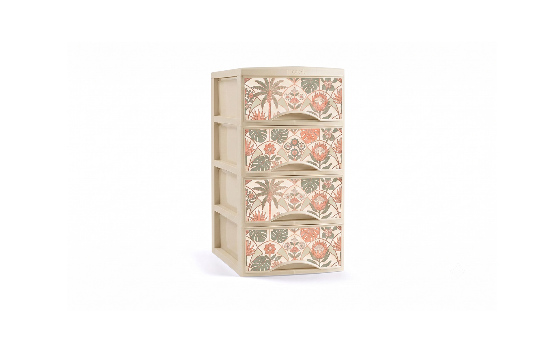
During the IML injection molding process, the film needs to undergo a certain degree of stretching as the molten plastic flows. During IMD molding, the film stretch rate can reach 10%-30%. This 10%-30% stretching, on large flat surfaces like drawer panels, has two direct consequences:
First, pattern deformation. A pattern that was originally circular may become elliptical; a square may become a parallelogram. A pattern designed in 2D will be elongated in curved or deep-cavity areas after molding.
Second, left-right color difference. The degree of stretching on the left and right sides of a drawer panel is often uneven—the side near the gate stretches less, while the side farther from the gate stretches more. The same ink layer, in areas with different stretching degrees, will have different thicknesses: areas with more stretching have thinner ink layers and lighter colors; areas with less stretching have relatively thicker ink layers and darker colors. This results in a visible color difference between the left and right sides.
For large-area full-face patterns, this left-right color difference and deformation will be magnified and clearly visible. Fortunately, this problem can be addressed through design—not by "fighting" the stretching, but by making the design "comply" with the stretching.
2. Pattern Direction – Let Stretching "Follow" the Texture
Core principle: The texture direction should align with the melt flow direction.
During drawer panel injection molding, molten plastic enters the cavity from the gate and flows along a primary direction. The label film is stretched most in this flow direction.
If the textures and lines in the pattern are perpendicular to the melt flow direction, stretching will "pull the texture askew"—straight lines become wavy, parallel lines become radial. If the texture direction is parallel to the flow direction, stretching simply "lengthens" the texture without changing its proportions, resulting in a more natural visual appearance.
Practical recommendations:
- The direction of lines in simulated textures like wood grain and stone grain should preferentially be parallel to the long side direction of the drawer panel (which is also the melt flow direction in most cases)
- Avoid layouts where textures are perpendicular to the flow direction
- Confirm the gate position with the mold engineer during the design phase to clarify the melt flow direction
Design example: For an 800mm-wide large drawer panel with the gate at the bottom center, a wood grain designed as vertical (from bottom to top) will simply be "lengthened" slightly by stretching, maintaining a visually coordinated proportion. If the wood grain is designed as horizontal, stretching will cause the grain lines to warp and become uneven.
3. Gradient Layout – "Hide" the Stretching in the Gradient
Core principle: If you cannot avoid the color difference caused by stretching, let the gradient "absorb" it.
The essence of left-right color difference is: for the same color, the ink layer thickness and color depth vary in areas with different degrees of stretching. But if the pattern itself is gradient—with colors transitioning from deep to light, from rich to faint—then "darker on one side and lighter on the other" is no longer a defect, but part of the design.
Practical recommendations:
- For large-area full-face patterns, prioritize gradient design over solid color coverage
- The gradient direction should align with the stretching direction (design lighter colors in areas with more stretching, darker colors in areas with less stretching)
- The gradient range should be wide enough to "cover" the color difference caused by stretching within the gradient range
Design example: Design the drawer panel as a gradient from light grey at the top to dark grey at the bottom. During injection, even if the light grey area at the top becomes lighter due to stretching, it still falls within the "light grey" range; even if the dark grey area at the bottom becomes lighter, it still falls within the "dark grey" range—the stretching difference between the left and right sides is "digested" by the gradient.
4. Symmetrical Composition – "Offset" Stretching Deviation with Symmetry
Core principle: With a left-right symmetrical pattern, stretching deviations are visually "averaged out."
If the pattern is perfectly left-right symmetrical, even if the left and right sides experience different degrees of stretching, the deformation on both sides will occur symmetrically—both sides are lengthened the same amount. The human eye has a high tolerance for "symmetrical deformation" and may not even perceive it as deformation.
Practical recommendations:
- For large-area full-face patterns, use left-right symmetrical composition
- Center the LOGO, with decorative elements mirrored left and right
- Avoid patterns with a visual center of gravity biased to the left or right—off-center patterns become more visually unbalanced after stretching
5. Diagonal Fine Lines and Dense Dot Screens – Two "High-Risk" Designs
5.1 Diagonal Fine Lines
Diagonal patterns (45° diagonal lines, herringbone patterns, diamond patterns, etc.) carry the highest risk in large-area IML patterns.
Diagonal lines are neither parallel nor perpendicular to the melt flow direction—they cross it. During stretching, diagonal lines experience displacement in both the X and Y axes simultaneously—resulting in the most complex and uncontrollable deformation. A uniform diagonal pattern may become unevenly spaced and twisted after stretching.
Recommendation: For large-area full-face drawer panels, avoid diagonal fine lines whenever possible. If diagonal patterns are essential, increase the line width (≥0.3mm) and spacing to reduce the visual impact of stretching on the pattern.
5.2 Dense Dot Screens
High-density dot screens are often used on light backgrounds to create a "breathable" feel or simulate stone effects. However, in large-area injection molding, dot screen areas are hotspots for bubbles.
The gaps between dots become collection points for air and volatilized solvents during the high temperatures of injection molding. If bubbles appear in light-colored areas of a full-face pattern, they are very noticeable. A more subtle problem: after stretching, dot density changes—areas with more stretching have sparser dots and lighter colors; areas with less stretching have denser dots and darker colors. This creates a left-right color difference.
Recommendation: For large-area full-face patterns, limit dot coverage to ≤70% to leave channels for gas evacuation. If possible, use solid gradients instead of dot screen gradients—sacrificing a bit of "breathability" for yield.
6. FAQ
Because the film stretches unevenly during injection molding. The side near the gate stretches less, leaving the ink layer thicker and darker; the side farther from the gate stretches more, thinning the ink layer and making it lighter. This creates the left-right color difference.
Yes. Based on the mold geometry and expected stretch rate, patterns in curved or deep-cavity areas can be pre-shrunk to ensure they return to normal proportions after molding. However, the stretching distribution on large flat panels is more complex, and design compensation requires coordination with the mold engineer.
Left-right symmetry + gradient direction aligned with the stretching direction. Symmetry visually "averages out" stretching deformation, while the gradient "absorbs" color difference into the design rather than exposing it as a defect.
Diagonal lines cross the melt flow direction. During stretching, the lines experience displacement in both the X and Y axes simultaneously—resulting in the most complex and uncontrollable deformation. Large-area full-face patterns should avoid diagonal fine lines.
The ink layer in dot screen areas is discontinuous. At the high temperatures of injection molding, air and volatiles trapped in the gaps between dots can form bubbles. Additionally, changes in dot density after stretching can lead to left-right color difference. Recommended dot coverage ≤70%, or switch to solid gradients.
Wood grain should be parallel to the melt flow direction (typically along the long side of the drawer panel), with line width ≥0.15mm and spacing ≥0.3mm. This way, stretching simply "lengthens" the grain without distorting its shape.
Contact Us
Name*
Telephone*
Region*
Please fill in your request*


