
IML Labels for Drawer Cabinets with Gradients, Wood Grain, Stone Grain, and Other Simulated Textures – Which Design Pitfalls to Avoid?
IML Labels for Drawer Cabinets with Gradients, Wood Grain, Stone Grain, and Other Simulated Textures – Which Design Pitfalls to Avoid?
Wood grain, stone grain, and gradients on drawer cabinet surfaces have become the "standard aesthetic" for mid-to-high-end home products.
But many designers think a design looks "great" on screen, only to find when the product is made – either the color is mottled, bubbles are everywhere, or the texture is blurred into a mess.
Where's the problem? It's not on the injection molding machine – it's at the design stage. The unique nature of IML (In-Mold Labeling) means: a pattern that looks "good" on a design file may not be "producible" during molding.
This article breaks down the most common pitfalls in IML label simulated texture design from three dimensions – large-area light gradients, high dot screen light backgrounds, and wood/stone grain textures – and provides safe design ranges that balance aesthetics with molding yield.
📖 Table of Contents
- 1. First Understand: The "Three-Layer Logic" of IML Simulated Textures
- 2. Pitfall 1: Large-Area Light Gradients – Thought "Fade-out" Was Beautiful, But "Color Mottling" Is the Reality
- 3. Pitfall 2: High Dot Screen Light Backgrounds – Thought "Breathability" Was Premium, But "Bubbles" Are the Result
- 4. Pitfall 3: Wood Grain and Stone Grain Textures – Thought "More Realistic" Was Better, But "Denser" Means "Riskier"
- 5. Safe Design Ranges for Simulated Textures
- 6. FAQ
1. First Understand: The "Three-Layer Logic" of IML Simulated Textures
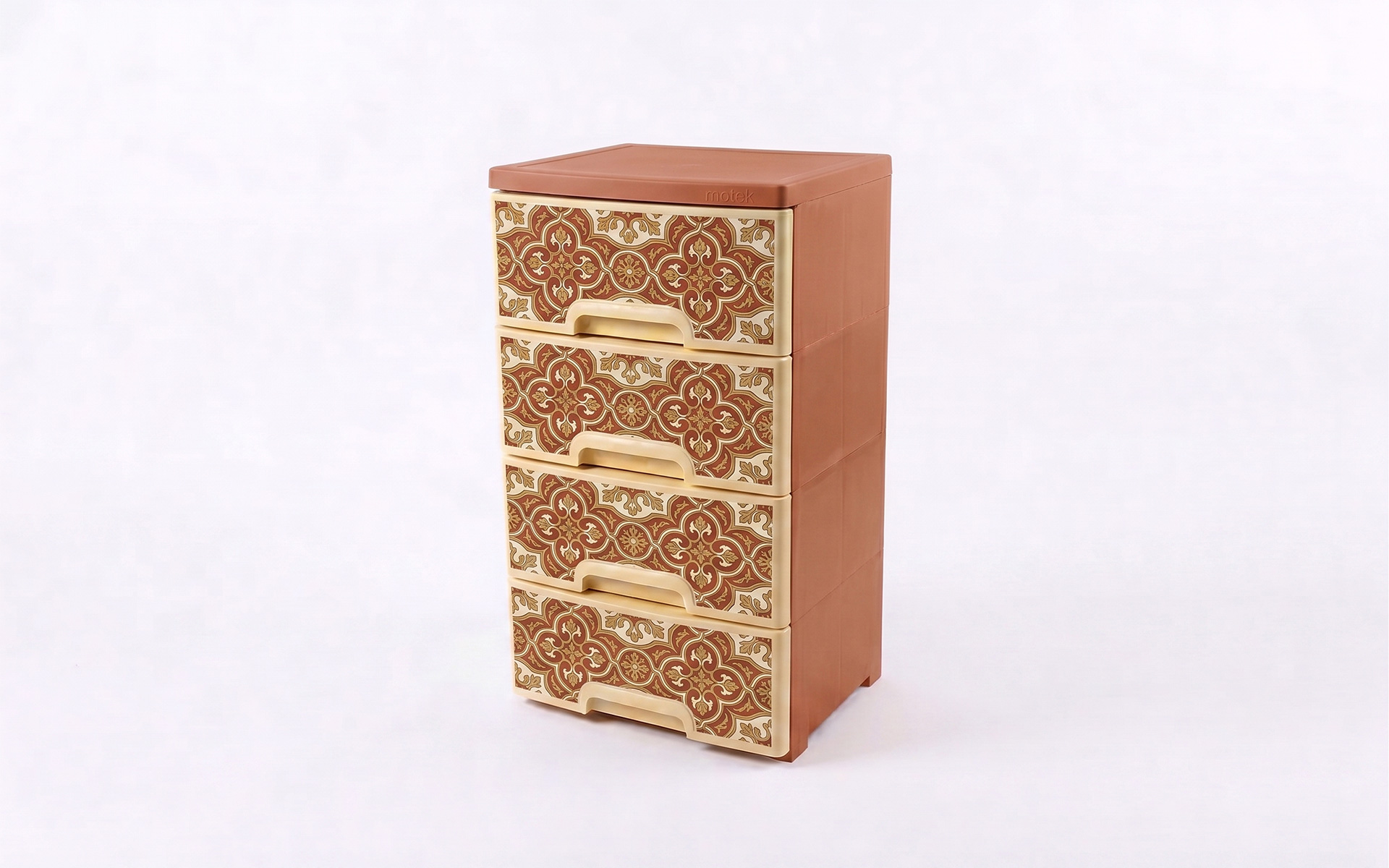
Before diving into the pitfalls, it's essential to understand one core fact: IML label textures are not "printed directly onto the plastic" – they are printed on the inside of the film and then fused with the plastic.
An IML label consists of three layers from outside to inside: film, ink, plastic. The ink is sandwiched between the film and the plastic, making it wear-resistant, scratch-resistant, and fade-proof.
But this "sandwich structure" also means: the thickness, uniformity, and adhesion of the ink layer directly determine molding yield. The gradients, textures, and backgrounds in the design must all withstand the "high temperature and high pressure" of injection molding. Ink that is too thick, too thin, too dense, or too sparse – all will reveal problems during molding.
The essence of simulated texture design is not "how realistic it looks," but "how realistic it can look within the limits of what the process allows."
2. Pitfall 1: Large-Area Light Gradients – Thought "Fade-out" Was Beautiful, But "Color Mottling" Is the Reality
2.1 What Is a Large-Area Light Gradient?
A large-area light gradient is a design where color smoothly transitions from one color to another (or transparent), and the light-colored areas occupy a large proportion of the design. For example, a drawer panel transitioning from white to light grey, or from beige to transparent.
2.2 Why Are Large-Area Light Gradients Prone to Problems?
Core reason: the ink layer in light-colored areas is too thin.
Gradients are achieved through continuous variation in ink thickness. Darker areas have thicker ink; lighter areas have thinner ink. When the ink in light areas becomes thin enough, two problems arise:
Issue 1: Color mottling (uneven color)
The ink layer in light areas is thin. Any slight fluctuation in printing pressure or ink viscosity will cause uneven color – appearing "mottled." On large flat surfaces like drawer panels, color mottling is magnified and highly visible.
Issue 2: Insufficient opacity
Light-colored inks naturally have lower opacity than dark inks. If there is no white base underneath, or if the white base is uneven in thickness, the light areas will "show through" the substrate color or the white base, resulting in discontinuous gradient steps and harsh transitions.
2.3 Prevention Solutions
| Design Point | Specific Measures |
|---|---|
| Control gradient range | Ensure ink thickness in light areas stays above the minimum threshold; avoid excessive "fade-out" |
| White base support | Light gradient areas must have a white base underneath, with uniform white base thickness |
| Gradient direction | Prefer dark to light direction (thick ink in dark areas → thin ink in light areas) over light to dark |
| Gradient length | For large-area gradients (covering over 50% of the label), consider segmented design – use decorative lines or textures to "break up" the gradient area, dispersing visual attention |
3. Pitfall 2: High Dot Screen Light Backgrounds – Thought "Breathability" Was Premium, But "Bubbles" Are the Result
3.1 What Is a High Dot Screen Light Background?
A high dot screen light background uses high-density dots (small dots) on a light background to create gradient or textured effects. Common in faux stone, faux cement, faux fabric designs – from a distance, they appear as uniform light textures; up close, they are密密麻麻 dots.
3.2 Why Do High Dot Screen Light Backgrounds Prone to Bubbles?
Core reason: the ink layer in dot screen areas is "discontinuous."
The ink layer in high dot screen areas is intermittent – there are gaps between the dots. During injection molding at high temperatures, air and volatilized solvents trapped in these gaps accumulate, forming microscopic bubbles.
If bubbles occur in light areas on dark drawer panels, they are extremely noticeable – bubbles on a light background are like black spots on white paper – visible at a glance.
3.3 Prevention Solutions
| Design Point | Specific Measures |
|---|---|
| Control dot density | Dot coverage in high dot screen background areas should not exceed 70%, leaving channels for gas evacuation |
| Control white ink thickness | White ink underneath high dot screen areas should not be too thick, otherwise more volatiles are released |
| Optimize venting design | IML mold vent slots should be controlled at 0.02-0.04mm depth to ensure smooth gas evacuation |
| Switch to solid + texture | If bubbles persist in high dot screen areas, switch to solid light color + screen-printed texture – sacrificing a bit of "breathability" for yield |
4. Pitfall 3: Wood Grain and Stone Grain Textures – Thought "More Realistic" Was Better, But "Denser" Means "Riskier"
4.1 What Are Simulated Textures?
IML can simulate almost any CMF effect: metal, wood grain, leather, stone, and more. Designers love using wood grain and stone grain on drawer cabinets because it makes plastic look like "solid wood" or "natural stone" – instantly elevating the premium feel.
4.2 Why Are Simulated Textures Prone to Problems?
Core reason: the denser the texture and the finer the lines, the more severe the stretching deformation during injection molding.
IML film stretches during molding (stretch rates can reach 10%-30%). Fine wood grain lines, stone grain veins – these delicate textures will deform, warp, and break during stretching. A texture that looks "very realistic" in the design may become "a blurry mess" after molding.
Another issue: conflict between texture direction and draft direction.
The edges of IML parts are exposed. If the draft angle is insufficient, the film at the edges will be "scraped." If the wood grain or stone grain texture direction is perpendicular to the draft direction, the texture will be severely stretched or even torn at the edges.
4.3 Prevention Solutions
| Design Point | Specific Measures |
|---|---|
| Control texture density | Wood grain growth rings and stone grain veins should have line width ≥0.15mm and spacing ≥0.3mm |
| Optimize texture direction | Wood grain direction should preferably be parallel to the draft direction to avoid stretch deformation in the perpendicular direction |
| Simplify edges | Within 5-10mm of the drawer panel edges, simplify textures or fade them out to avoid breakage caused by edge stretching |
| Prototype verification | Simulated textures are the most difficult to get right on the first try in IML. Always run prototypes before mass production to verify the actual effect of the texture after molding |
5. Safe Design Ranges for Simulated Textures
Based on the above analysis, the "safe design ranges" for IML label simulated textures on drawer cabinets can be summarized as follows:
5.1 Safe Range for Gradient Design
- Gradient range: ensure ink thickness in light areas stays above the minimum threshold; avoid excessive "fade-out"
- Gradient direction: dark to light is safer than light to dark
- Gradient area: if exceeding 50% of the label area, consider segmented design
- White base support: light gradient areas must have white base with uniform thickness
5.2 Safe Range for High Dot Screen Design
- Dot coverage: ≤70%, leaving sufficient exhaust channels
- White ink thickness: not too thick
- Mold venting: vent slot depth 0.02-0.04mm
- Alternative: if bubbles persist, switch to solid light color + screen-printed texture
5.3 Safe Range for Simulated Textures
- Minimum line width: ≥0.15mm
- Minimum spacing: ≥0.3mm
- Texture direction: parallel to draft direction
- Edge treatment: simplify or fade out texture within 5-10mm of edges
- Draft angle: ≥3°, recommended 5°
- Exposed edge control: allow within 0.1mm of exposed edge
6. FAQ
The ink layer in light areas is thin. Printing pressure fluctuations and ink viscosity changes can both cause uneven color. Control the gradient range and lay a uniform white base underneath the light areas.
The ink layer in dot screen areas is discontinuous. At injection molding temperatures, air and volatiles trapped in the gaps between dots accumulate to form bubbles. Control dot coverage to ≤70% and optimize mold venting.
No. The denser the texture and the finer the lines, the more severe the deformation during injection stretching. Wood grain lines should be ≥0.15mm wide with spacing ≥0.3mm, and texture direction should be parallel to the draft direction.
Yes. IML film stretch rates during molding can reach 10%-30%. For textures in curved or deep-cavity areas, the design should be pre-shrunk to ensure normal proportions after molding.
Absolutely. Simulated textures are the most difficult IML design type to get right on the first try. Prototyping is the last opportunity to verify the molded texture effect and identify design flaws.
The edges of IML parts are exposed. When the draft angle is insufficient, the film at the edges gets stretched. Simplify or fade out textures within 5-10mm of the edges, and maintain a draft angle of ≥3° (5° recommended).
Dark-to-light is safer. Dark areas have thicker ink and stronger opacity; light areas have thinner ink and are more sensitive to process fluctuations. If the design must go from light to dark, add white base support in the light areas.
Contact Us
Name*
Telephone*
Region*
Please fill in your request*


