
Weather-Resistant Color Matching Design for Outdoor Returnable Containers: How High-Saturation Color Schemes Delay Visual Fading
Weather-Resistant Color Matching Design for Outdoor Returnable Containers: How High-Saturation Color Schemes Delay Visual Fading
In warehousing logistics, agricultural harvesting, and outdoor construction – once returnable containers are moved outdoors, they begin a "protracted war" with ultraviolet radiation. The UV rays in sunlight gradually cause the colors of plastic products to fade, turn white, and darken. After just six months outdoors, ordinary containers may show significant color degradation.
But for returnable container brands, color is identity. Among hundreds of containers in a warehouse, what allows a quick visual identification of one's own product is that signature blue or red. If the color fades, brand recognition fades with it.
So, how should outdoor returnable containers be color-selected and matched to withstand sun and rain? Can high-saturation color schemes really delay visual fading?
📖 Table of Contents
- 1. The "Culprit" of Outdoor Container Fading: How UV "Eats" Color
- 2. Core Principle of Weather-Resistant Color Schemes: Choosing the Right Pigment Matters More Than Choosing the Right Color
- 3. How High-Saturation Color Schemes "Fool" the Eye and Delay Visual Fading
- 4. The Natural Advantage of IML: Ink Is "Hidden" Away
- 5. Practical Guide to Weather-Resistant Color Matching for Outdoor Containers
- 6. FAQ
1. The "Culprit" of Outdoor Container Fading: How UV "Eats" Color
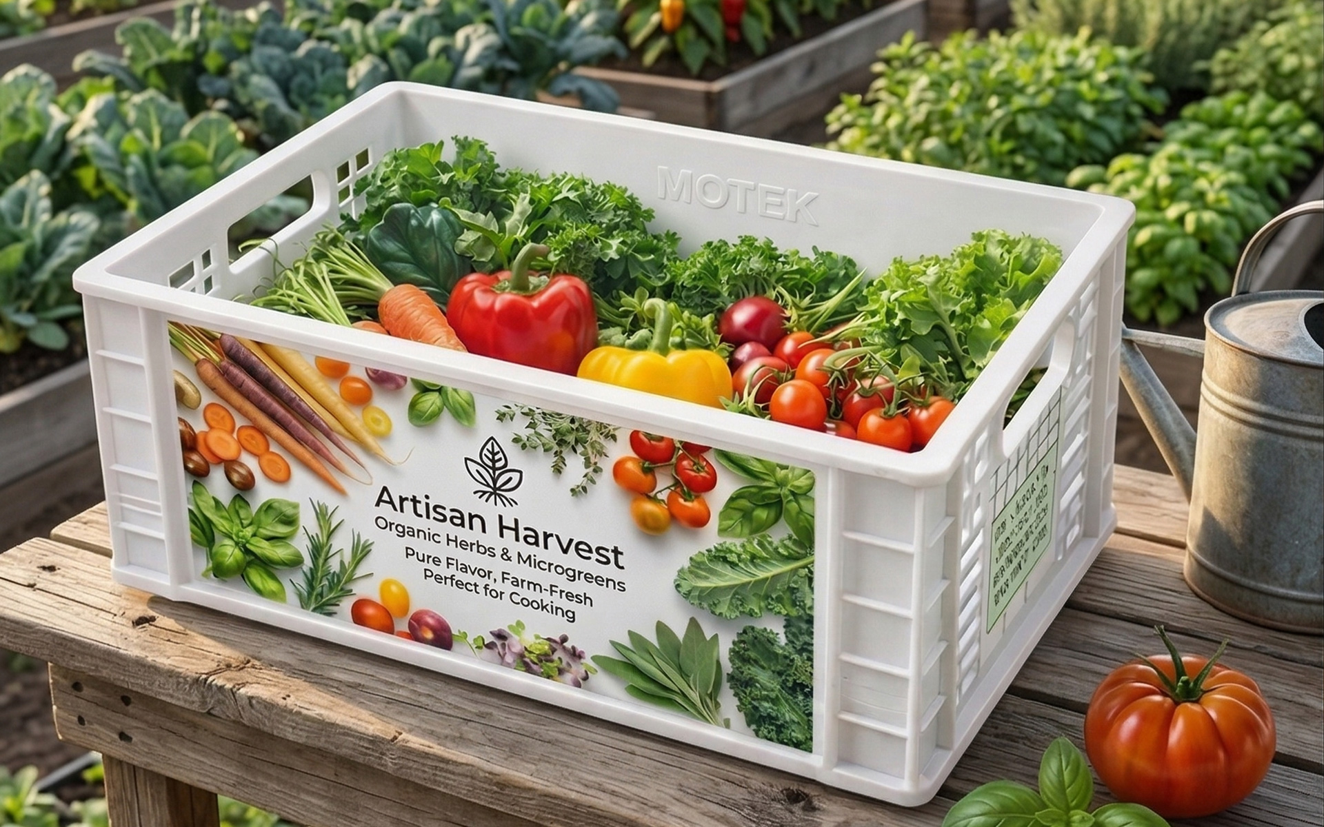
When returnable containers are placed outdoors, UV radiation in sunlight is the number one enemy of color. UV rays destroy the chemical structure of pigment molecules, causing photo-oxidative degradation reactions that gradually lighten, darken, or even eliminate colors.
Specifically, UV energy breaks polymer molecular chains, generating free radicals that trigger chain degradation reactions. Once pigment molecules are destroyed, the originally vibrant colors gradually fade.
But the problem doesn't stop there. The resin itself also ages and changes color under UV exposure. Pigment fading combined with resin yellowing – under this double attack, the container's color quickly becomes "unrecognizable."
2. Core Principle of Weather-Resistant Color Schemes: Choosing the Right Pigment Matters More Than Choosing the Right Color
The primary principle for outdoor container color selection is not "what color looks good," but "what pigment is lightfast."
2.1 Lightfastness Rating: The Hard Indicator for Outdoor Color Selection
The pigment industry uses lightfastness ratings to measure a pigment's resistance to light-induced fading, with ratings from 1 (poorest) to 8 (best). Plastic products used outdoors long-term must choose pigments with a lightfastness rating of 7 or higher.
Which pigments have good lightfastness?
| Pigment Type | Representative Varieties | Lightfastness Rating | Characteristics |
|---|---|---|---|
| Phthalocyanine Blue/Green | Pigment Blue 15:1, 15:3, Pigment Green 7 | 7-8 | Vibrant colors, excellent weather resistance; top choice for outdoor blue containers |
| DPP Red | Pigment Red 254 | 7-8 | High-saturation red, outstanding weather resistance |
| Benzimidazolone Yellow | Pigment Yellow 151 | 7-8 | Strong weather resistance, suitable for colored containers |
| High-Performance Violet | Pigment Violet 23 | 8 | Bright violet, but performance decreases at low concentrations |
Phthalocyanine blue pigments have strong tinting strength and excellent heat resistance, making them the most mature choice for outdoor blue containers. Meanwhile, those containers that "look vibrant but fade within six months" on the market are most likely using low-end pigments with insufficient lightfastness ratings.
2.2 Avoiding the "Fading Trap": Why Are Light Colors Less Sun-Resistant?
Light colors are more prone to visible fading in outdoor environments. The reason:
Light-colored plastic products are typically formulated with large amounts of titanium dioxide (white pigment) and small amounts of color pigment. When most organic pigments are mixed with titanium dioxide, their weather resistance decreases to varying degrees. This means:
- Light blue, light pink, light yellow – low pigment concentration, high titanium dioxide content, weather resistance is "diluted"
- Dark blue, dark red, dark green – high pigment concentration, low titanium dioxide content, stronger weather resistance
This is why the industry-standard "grey and blue" color system for outdoor returnable containers – grey and blue are often UV-stabilized. Grey itself contains carbon black and other pigments with excellent weather resistance, while the phthalocyanine blue series in blue pigments is inherently a "top performer" in lightfastness ratings.
Design recommendation: For outdoor container branding and identification, avoid large areas of light colors whenever possible. If the brand color itself is light, use dark borders or dark backgrounds to "protect" the light-colored areas.
3. How High-Saturation Color Schemes "Fool" the Eye and Delay Visual Fading
Returning to the core question of this article's title: Can high-saturation color schemes really delay visual fading?
The answer is: Yes – they can delay "perceived" fading.
3.1 The "Visual Redundancy" of High-Saturation Colors
There is a basic rule in color science: the higher the saturation, the greater the color difference required to shift from "vibrant" to "not vibrant."
A high-saturation "Ferrari red" fading from ΔE=0 to ΔE=5 visually only changes from "very red" to "somewhat red" – still perceived as red. A low-saturation light pink fading from ΔE=0 to ΔE=3 may already shift from "pink" to "almost white" – visually perceived as "severely faded."
High-saturation colors provide greater "visual redundancy space" – under the same UV exposure conditions, high-saturation colors "appear to last longer."
Pigments with lightfastness and weather resistance ratings of 8 remain vibrant even after years of outdoor use.
3.2 The "Psychological Compensation" of High-Saturation Colors
When consumers see a high-saturation returnable container, their first impression is "vibrant, eye-catching, good quality." Even after some use, when the color fades from "very vibrant" to "somewhat vibrant," consumer perception remains that "the color is still there." But once low-saturation colors begin to fade, they quickly enter the "washed-out, old-looking" visual range.
In one sentence: High-saturation color schemes don't stop colors from fading – they make fading "less noticeable."
4. The Natural Advantage of IML: Ink Is "Hidden" Away
For containers using IML (In-Mold Labeling) labels, there is an additional safeguard for color weather resistance: the ink is sandwiched between the hardened transparent film and the plastic substrate.
The typical structure of an IML label is:
- Outer layer: Hardened transparent film (protective layer)
- Middle layer: Printed ink (color layer)
- Inner layer: Plastic substrate (fused with the container body)
The ink does not directly contact air or UV radiation, so IML labels can maintain bright colors for a long time without fading.
However, this does not mean IML labels can ignore pigment selection – if the ink itself has insufficient lightfastness, UV radiation will still penetrate the film and accelerate ink aging even if it is protected inside. IML is a "bonus," not a substitute for "choosing the right pigment" – the fundamental requirement.
5. Practical Guide to Weather-Resistant Color Matching for Outdoor Containers
5.1 Color Selection Priority
| Priority | Color Type | Recommended Pigment | Weather Resistance Performance |
|---|---|---|---|
| Top Choice | Dark blue, dark green, dark grey, black | Phthalocyanine blue, phthalocyanine green, carbon black | Lightfastness rating 7-8; excellent outdoor stability |
| Recommended | High-saturation red, orange | DPP red, high-performance orange | Lightfastness rating 7-8; eye-catching and sun-resistant |
| Use with Caution | Light blue, light pink, light yellow | Low-concentration organic pigment + titanium dioxide | Weather resistance diluted; noticeable fading |
| Avoid | Large-area pure white, extremely light colors | High titanium dioxide content | UV accelerates yellowing and darkening |
5.2 Three Golden Rules of Color Matching Design
Golden Rule 1: Brand colors should prioritize dark or high-saturation colors.
If the brand color is light, use it as an accent color rather than the primary color – for example, use light for the logo but dark for the label background.
Golden Rule 2: Outdoor labels must be paired with a UV stabilizer system.
Pigment lightfastness alone is not enough. The container's color formulation must include sufficient UV absorbers and antioxidant stabilizers to prevent resin discoloration. In polyolefin anti-aging systems, typically about 0.1% antioxidant and 0.5% light stabilizer can be added to meet outdoor anti-aging requirements.
Golden Rule 3: Light-colored areas must have a white base layer (on dark substrates).
For light-colored labels on dark PP substrates, a white base layer is not optional – it's mandatory. The white base not only improves color fidelity but also reflects some UV radiation, slowing ink aging.
5.3 High-Saturation vs. Low-Saturation Color Schemes
| Comparison Dimension | High-Saturation Color Scheme | Low-Saturation Color Scheme |
|---|---|---|
| Initial Visual Impact | ⭐⭐⭐⭐⭐ Strong | ⭐⭐ Soft |
| Fading Tolerance | High (large visual redundancy) | Low (slight fading is very noticeable) |
| Outdoor Brand Recognition | High | Medium-Low |
| Suitable Scenarios | Brand identity, color coding | Understated style, indoor use |
6. FAQ
Dark blue, dark grey, and black are the most sun-resistant choices. The phthalocyanine blue series in blue pigments can achieve lightfastness ratings of 7-8, and the carbon black component in grey pigments has excellent UV resistance. Most outdoor containers choose the "grey and blue" combination for this reason.
High-saturation color schemes cannot stop pigment molecular degradation, but they can delay visually perceived fading. High-saturation colors have greater "visual redundancy space" – requiring a larger color difference to shift from "very vibrant" to "somewhat vibrant," so they appear "more sun-resistant" under the same light exposure.
Light colors are typically formulated with large amounts of titanium dioxide and small amounts of color pigment. Most organic pigments have reduced weather resistance when mixed with titanium dioxide. Additionally, light colors have low saturation, so even a slight fading is visually magnified.
Yes. Although IML "hides" the ink between the film and plastic, UV radiation still penetrates the film. Outdoor IML labels must use inks with lightfastness ratings of 7 or higher, combined with a UV stabilizer system.
Dark, high-saturation colors are safest. Dark blue, dark red, dark green, and other colors fade slowly outdoors and have high visual tolerance. If the brand color is light, use a dark background to set it off, or use the light color as an accent rather than the primary color.
Yes. Professional container UV resistance testing can evaluate product weather resistance and color fastness under UV exposure. QUV accelerated aging testing is a commonly used industry method that simulates color changes under long-term outdoor light exposure.
Contact Us
Name*
Telephone*
Region*
Please fill in your request*


