
Transparent Returnable Containers – Reverse IML Label Graphic Mirror Layout Design Techniques and Pitfall Avoidance Details
Transparent Returnable Containers – Reverse IML Label Graphic Mirror Layout Design Techniques and Pitfall Avoidance Details
Transparent returnable containers are becoming increasingly popular in warehousing, logistics, and retail display – you can see the contents directly, giving a clean, professional look. However, when transparent containers are paired with IML (In-Mold Labeling) labels, there is a "counterintuitive" design requirement: graphics and text need to be mirror-reversed.
Why? How is it done? What are the pitfalls? This article provides a systematic guide to the design essentials for reverse IML labels on transparent returnable containers, from principles to practical implementation.
📖 Table of Contents
1. First Understand: What Is "Reverse Printing"?
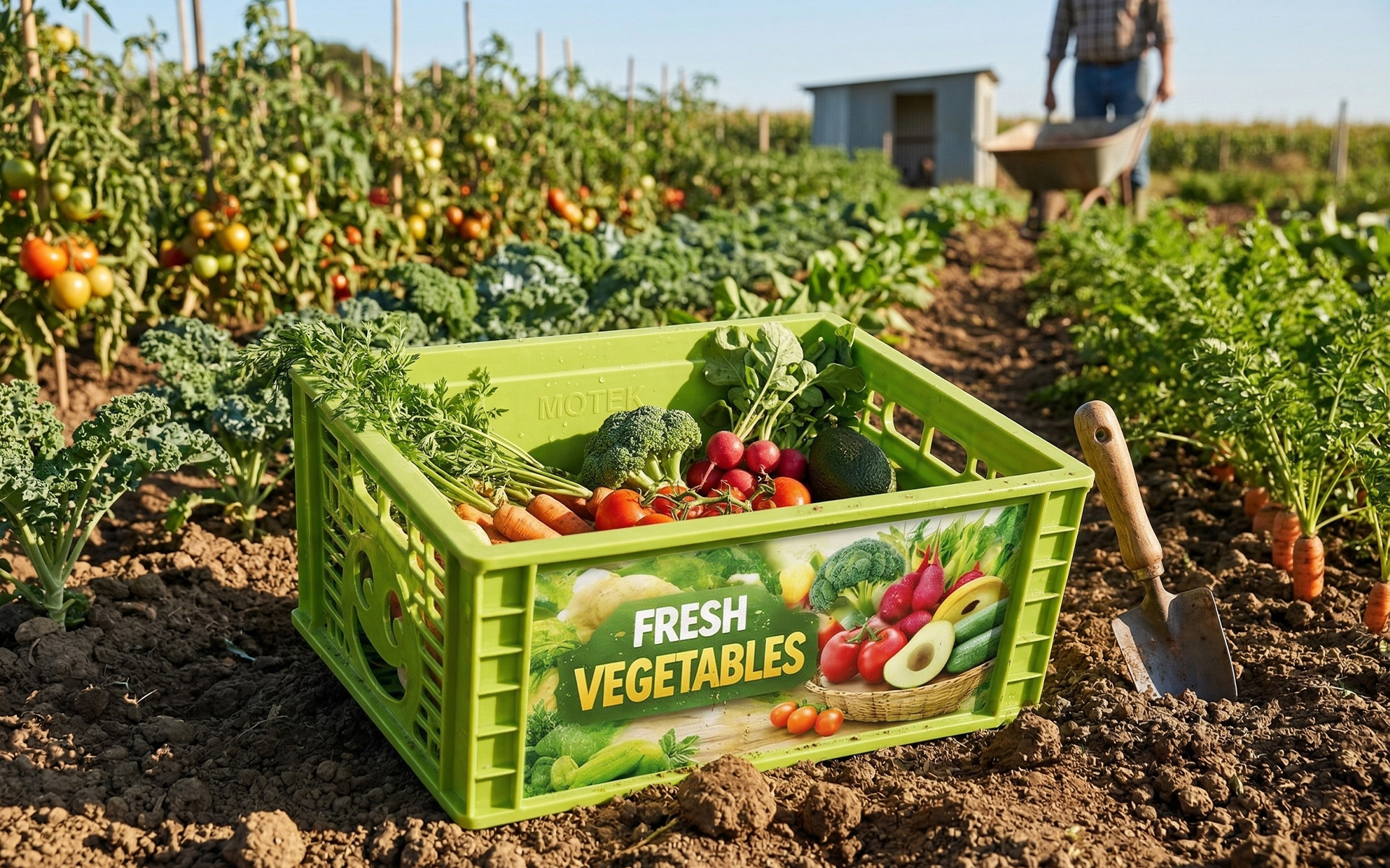
IML label printing has two methods: forward printing and reverse printing.
Forward printing (front printing): Ink is printed directly on the outer surface of the film. The pattern appears correct when viewed from the outside. This method is suitable for opaque containers – the ink is on the film surface, and after molding, it is "blocked" by the container substrate, so the pattern appears normal from the outside.
Reverse printing (back printing): Ink is printed on the inner surface of the film (the side that contacts the injection resin). The pattern is printed from the back side. After molding, when viewed from the front (outside) of the film, the pattern appears correct.
Forward printing: Ink on the film surface → Viewed from outside, the pattern is correct
Reverse printing: Ink on the back of the film → Viewed from outside, the pattern is mirrored → Requires mirror-reverse design
For transparent returnable containers, since the container is transparent, the ink on the back of the film is directly visible from the outside. If the design file is laid out in the normal orientation, when printed on the back of the film, it will appear reversed when viewed from the outside – text is left-right reversed, and pattern orientation is wrong. Therefore, reverse IML labels on transparent containers must be pre-mirrored at the design stage.
2. Why Does Transparent Container Require Mirror-Reverse Design?
2.1 Visual Principle
The viewing path for an IML label on a transparent returnable container is: eyes → transparent film → ink layer (on the back of the film).
Because the viewing path goes from "front to back," if the pattern on the ink layer is correct, it will appear reversed from the outside. If the pattern on the ink layer is reversed (mirrored), it will appear correct from the outside.
2.2 Consequences of Not Mirroring
If the design file is sent to the printer without mirroring:
- Text is left-right reversed – "ABC" becomes "Ɔ∀," completely unreadable
- Logo orientation is wrong – brand mark faces the wrong direction
- Pattern orientation is confused – arrows point backward, figures face the wrong way
These errors can be caught during sampling, but if production proceeds without correction, the entire batch will be scrapped.
3. Practical Tips for Mirror-Reverse Design
3.1 Which Elements Need to Be Mirrored?
All graphic and text elements need to be mirrored, including:
- Brand Logo
- Text (brand name, classification name, specifications)
- Decorative patterns
- Directional graphics such as arrows and indicator symbols
The only elements that do not need mirroring: perfectly symmetrical patterns (such as perfect circles, squares, symmetrical geometric patterns) – mirroring makes no difference.
3.2 How to Perform Mirror-Reverse
In design software (such as Adobe Illustrator or CorelDRAW):
- Select all graphic and text elements
- Use the horizontal flip function (not vertical flip)
- Check that all text is now mirrored
- Special attention: Directional graphics (arrows, hand gestures, side profiles, etc.) need individual confirmation of flip direction
3.3 Readability Verification of Mirrored Text
After mirroring, the text on the design file will appear "reversed" – this is normal. But you need to confirm:
- Sampling verification: Always run samples before mass production to check the final effect viewed from the front (outside) of the film
- Font size check: Mirrored text maintains the same line width, but the reading direction is reversed – it's recommended to have someone unfamiliar with the design try reading the sample to ensure sufficient legibility
4. Minimum Line Width and Minimum Font Size: How Fine Can You Print?
While reverse IML printing has high precision, it is not infinitely fine. Design must adhere to the following minimum size limits:
4.1 Minimum Line Width
| Printing Method | Minimum Line Width | Note |
|---|---|---|
| Single-color (positive text) | ≥0.10mm | Can go as fine as 0.10mm |
| Single-color (reverse text) | ≥0.15mm | Reverse text/lines need to be thicker |
| Multi-color (positive text) | ≥0.20mm | Multi-color registration requires thicker lines |
| Multi-color (reverse text) | ≥0.20mm | Multi-color reverse text also ≥0.20mm |
Design recommendations:
- For transparent returnable container labels, recommend line width ≥0.20mm to ensure clear visibility under various lighting conditions
- Reverse text (light-colored text on dark background) should be at least 0.05mm thicker than positive text
- Avoid designing overly fine lines – on transparent containers, very fine lines can "disappear" in the light
4.2 Minimum Font Size
| Printing Method | Minimum Font Size | Note |
|---|---|---|
| Single-color positive text | ≥5pt | Can go as fine as 5pt |
| Single-color reverse text | ≥6pt | Reverse text needs to be larger |
| Multi-color positive/reverse text | ≥7pt | Multi-color text recommended ≥7pt |
Design recommendations:
- Key information (brand name, container number) on transparent containers recommended ≥10pt
- Secondary information (specifications, recycling symbols) recommended ≥7pt
- Reverse text on transparent containers has lower legibility – recommended font size 1-2pt larger than positive text
5. Layout: Balancing "Transparency" and "Clarity"
The core selling point of transparent returnable containers is transparency – being able to see the contents clearly. Label design should not sacrifice this transparency for the sake of being "prominent."
5.1 Three Principles of Layout
Principle 1: Partial coverage, leave plenty of transparent area
Labels don't need to cover the entire container. It is recommended to concentrate graphics and text on one side or one corner of the container, leaving the rest completely transparent. This ensures clear branding while preserving the container's transparency.
Principle 2: Information hierarchy, size pairing
Organize information into primary information (brand logo, container number) and secondary information (specifications, recycling symbols). Use large fonts and thick lines for primary information; small fonts and thin lines for secondary information. This creates visual hierarchy without looking cluttered.
Principle 3: Edge margins, avoid crowding
It is recommended to leave at least 3-5mm of margin space at the label edges. Text and graphics should not touch the edges – light refraction at the edges of transparent containers can make text that is too close to the edge appear "broken."
5.2 Color Selection on Transparent Backgrounds
On transparent containers, ink appearance differs from opaque containers:
| Color | Effect on Transparent Containers | Recommendation |
|---|---|---|
| White | Semi-transparent, weak opacity | Increase white ink layer thickness or use double white layer |
| Black | Clear, high contrast | Preferred, but large black areas reduce transparency |
| Bright colors (red, blue, green) | Saturated but affected by light | Recommended for logos and key information |
| Light colors (yellow, pink, light blue) | Easily "washed out" by light | Recommended for secondary information or decoration |
Design recommendations:
- Brand logos and key information should use dark colors (black, dark blue, dark green) for maximum legibility
- Secondary information and decorative lines can use brand colors or light colors to maintain transparency
- Avoid large dark color blocks – they obstruct visibility and undermine the core advantage of transparent containers
5.3 Size Adaptation: Label Proportion to Container Size
The label size on transparent returnable containers should be proportional to the container size:
| Container Size | Recommended Label Area | Note |
|---|---|---|
| Small (<30cm)<> | 20%-30% | Too large a label looks crowded |
| Medium (30-60cm) | 15%-25% | Balanced proportion, clarity and transparency |
| Large (>60cm) | 10%-20% | For large containers, label proportion can be reduced appropriately |
6. FAQ
A: Because reverse printing puts the ink on the back of the film. When viewed from the outside, the pattern appears mirrored. Only by pre-mirroring the design file will the final product appear correct from the outside. Without mirroring, text will be left-right reversed and logos will face the wrong direction.
A: This is normal. Be sure to run samples before mass production, and inspect the final result from the front (outside) of the film. It is recommended to have someone unfamiliar with the design try reading it to verify legibility.
A: Reverse text has lower legibility on transparent containers. It is recommended that reverse text be 1-2pt larger than positive text, with thicker line width. Key information should use dark positive text, not reverse text.
A: Single-color positive text minimum line width 0.10mm, minimum font size 5pt; multi-color printing recommended line width ≥0.20mm, font size ≥7pt. On transparent containers, it is recommended to increase thickness and size slightly to ensure clear visibility under various lighting conditions.
A: Recommended 10%-30% of the container surface area, depending on container size. Small containers 20%-30%, medium containers 15%-25%, large containers 10%-20%. The key is to maintain transparency while ensuring clear identification.
A: Dark colors (black, dark blue, dark green) have the highest contrast and best legibility on transparent containers. White and light colors have weak opacity on transparent backgrounds and are easily "washed out" by light. Key information should use dark colors; secondary information can use brand colors or light colors.
Contact Us
Name*
Telephone*
Region*
Please fill in your request*


