
Modular Combination Drawer Cabinets – How Can Serialized IML Labels Achieve Layout Unification for a Cohesive Whole-Home Storage Visual Identity?
Modular Combination Drawer Cabinets – How Can Serialized IML Labels Achieve Layout Unification for a Cohesive Whole-Home Storage Visual Identity?
The advantage of modular combination drawer cabinets lies in their "flexibility"—different numbers of tiers, different widths, and drawers with different functions can be freely combined according to the available space. But this flexibility also presents a challenge for brands: when 2-tier, 3-tier, and 5-tier drawer cabinets are displayed together, can consumers tell at a glance that they are from the same brand?
The answer depends on one critical capability: serialized IML label layout unification.
IML (In-Mold Labeling) technology fuses labels with the drawer panel during injection molding. Once the label's pattern, text, and colors are determined, they last as long as the product itself. This "one-shot molding, never peeling" characteristic allows the advantages of serialized design to be maintained over the long term—and also means that layout unification must be perfected at the design stage.
📖 Table of Contents
- 1. Core Elements of Serialized Label Layout Unification
- 2. Font Standardization – The "First Language" of Serialization
- 3. Color Value Control – Keeping Colors "Accurate and Consistent"
- 4. LOGO Position Alignment – The Visual Anchor for Drawers of Different Sizes
- 5. Decorative Element Standardization – The Smallest Unit of Brand Identity
- 6. Visual Alignment Techniques for Different Tiers and Widths
- 7. FAQ
1. Core Elements of Serialized Label Layout Unification
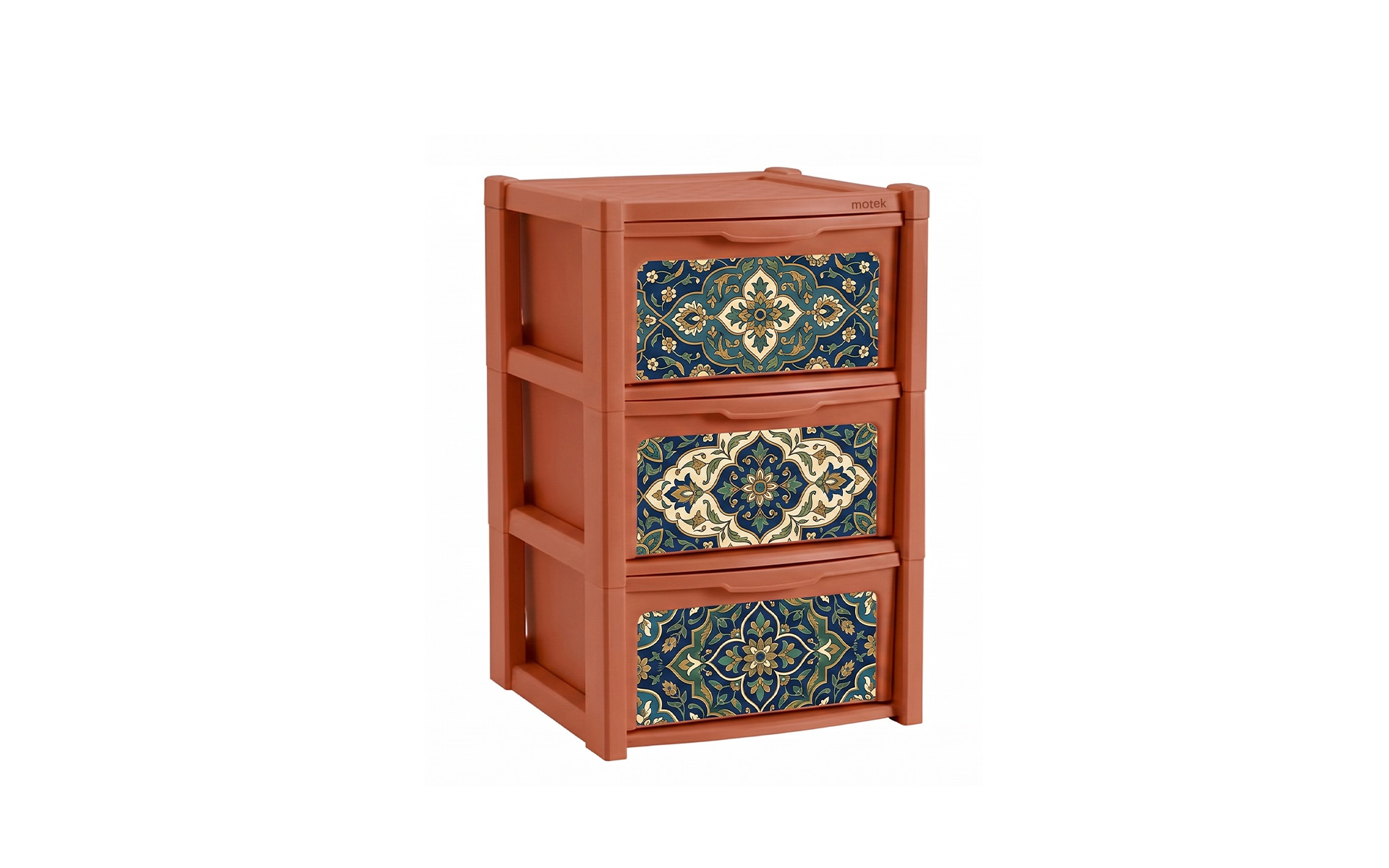
Serialized IML label layout unification is not simply "putting the same label on all drawers." It requires that under a unified set of design guidelines, labels of different sizes look like they belong to the same family.
The core elements span five dimensions:
| Dimension | Core Question | Unification Goal |
|---|---|---|
| Fonts | What font is used for brand name and classification text? | Consistent fonts, weights, and spacing across the entire series |
| Color values | What is the brand color? Where is it applied? | Consistent color across batches and specifications |
| LOGO position | Where is the LOGO placed on the drawer panel? | Visual alignment of LOGOs across different drawer widths |
| Decorative elements | How are lines, color blocks, and icons used? | Unified decorative language that forms brand recognition symbols |
| Information hierarchy | How are brand name, classification, and function icons arranged? | Clear hierarchy with consistent reading logic |
A key principle: standardization is not "one-size-fits-all" but "flexibility with rules." A 2-tier cabinet and a 5-tier cabinet have different label areas. Simply enlarging or shrinking the same label won't work—the LOGO might become too large and disproportionate, or the text too small to read. The essence of standardization is maintaining the same visual proportions and information hierarchy across different sizes.
2. Font Standardization – The "First Language" of Serialization
Typography is the most fundamental element of brand visual identity. On multi-specification drawer cabinets, font consistency directly affects consumer perception of whether products belong to the same brand.
2.1 Three Principles of Font Selection
Principle 1: Use the same font across the entire series. Brand name, classification labels, function descriptions—all text should use the same font (or the same font family with different weights). The font must not change across different tiers or widths.
Principle 2: Match the font to the brand's tone. Sans-serif fonts (e.g., Helvetica, Frutiger) suit modern minimalist styles; serif fonts or custom typefaces suit premium aesthetic styles. The font itself is an extension of the brand's personality.
Principle 3: Ensure readability. IML labels have minimum font size limits—positive text minimum 6pt, reverse text minimum 7pt. Designs must ensure classification text remains legible across different label sizes.
2.2 "Flexible Rules" for Weight and Size
Labels on different drawer widths require corresponding font size adjustments. But these adjustments should follow a set of "flexible rules":
| Drawer Width | Brand Name Size | Classification Text Size | Ratio |
|---|---|---|---|
| Narrow (<30cm)<> | 14-16pt | 8-10pt | Brand:Classification ≈ 1.6:1 |
| Standard (30-50cm) | 18-22pt | 10-12pt | Brand:Classification ≈ 1.8:1 |
| Wide (>50cm) | 24-30pt | 14-16pt | Brand:Classification ≈ 1.8:1 |
The key is not the fixed point size, but maintaining a consistent proportion between the brand name and classification text. When consumers see different-sized drawer cabinets, the visual "typographic rhythm" remains unified.
3. Color Value Control – Keeping Colors "Accurate and Consistent"
Color is the most sensitive element in brand identity. Color deviation is a major pitfall for serialized products—if two drawer cabinets placed side by side have logos in slightly different shades of red (one leaning orange, the other purple), the brand identity instantly falls apart.
3.1 The Three Layers of IML Color Management
IML label colors go through three stages: "film printing → injection molding → fusion with the substrate." The color looks one way on the film and another after molding and fusing with the plastic substrate. Therefore, IML color value control is more complex than ordinary printing:
Design stage: Use CMYK color mode and clearly specify brand colors with CMYK values and Pantone numbers.
Sampling stage: Through digital sampling and injection molding sampling, confirm the final product color and establish a standard color sample.
Production stage: Using the standard color sample as the benchmark, use a spectrophotometer for color measurement, ensuring color difference is controlled within ΔE≤2.0.
3.2 Key Color Management Points for Serialized Products
Point 1: Establish a brand color value archive. Clearly document CMYK values, Pantone numbers, and create physical color swatches. All specifications and all batches of labels must reference these standards.
Point 2: Consider the influence of substrate color. If the drawer cabinet's plastic substrate is dark, label colors may appear dull or grey. Solution: include a double white base layer in the pattern design to isolate the substrate color.
Point 3: Control color difference within and across batches. IML's registration process ensures precision through mechanical positioning, without relying on manual adjustment. Once the standard color sample is confirmed, all specifications and all batches are controlled to the same color standard.
4. LOGO Position Alignment – The Visual Anchor for Drawers of Different Sizes
The LOGO is the core element of brand identity. On multi-specification drawer cabinets, the LOGO's position determines the "brand focal point" consumers see first.
4.1 Three Common LOGO Positioning Strategies
Strategy 1: Fixed position (recommended). The LOGO is always placed in the same position on the drawer panel—for example, the top-left corner or center. Regardless of drawer width, the LOGO's X and Y coordinates are fixed.
- Advantage: Strongest visual consistency; consumers can instantly identify the brand mark
- Suitable for: Scenarios where brand recognition is the highest priority
Strategy 2: Proportional position. The LOGO's position adjusts proportionally with drawer size—always placed at the 1/3 point or golden ratio of the panel.
- Advantage: Visually proportional across different drawer sizes
- Suitable for: Series with significant width variations
Strategy 3: Fixed margin. The LOGO's distance from the panel edge is fixed (e.g., 20mm from the top-left corner), and the LOGO size scales proportionally with drawer size.
- Advantage: Balances consistency and proportion
- Suitable for: Most scenarios as a compromise solution
Recommended strategy: For modular combination drawer cabinets, the fixed position + fixed margin combination is the most practical—the LOGO remains in the top-left corner, margins are fixed, and size scales proportionally with drawer width.
4.2 Practical Tips for Visual Alignment
Point 1: Vertical alignment across different tiers. When 2-tier, 3-tier, and 5-tier cabinets are stacked together, the LOGO on each drawer should be on the same vertical line. This means the horizontal position (X coordinate) of the LOGO must be consistent across all drawers.
Point 2: Horizontal alignment across different widths. When narrow and wide cabinets are placed side by side, the LOGO's vertical position (Y coordinate) should be consistent—all LOGOs should be the same distance from the top edge of the panel.
Point 3: Unified visual weight. When LOGO size adjusts with drawer width, the visual weight should remain consistent—the LOGO on a narrow drawer should not be too small (appearing stingy), nor on a wide drawer too large (appearing clumsy).
5. Decorative Element Standardization – The Smallest Unit of Brand Identity
Beyond LOGOs and text, decorative elements are the "second language" of brand identity. A unified decorative language allows consumers to recognize the brand even without seeing the LOGO—simply through lines, color blocks, and icons.
5.1 Standardizable Decorative Elements
| Element | Standardization Content | Serialized Value |
|---|---|---|
| Decorative lines | Line weight, color, position (top/bottom/side) | Creates a unique "frame language" for the brand |
| Color blocks | Shape, proportion, position | "Color anchors" across different drawers |
| Function icons | Style (line/filled), size, position | Unified visual symbols for classification functions |
| Patterns/textures | Type, density, coverage | Enhances texture and increases recognizability |
5.2 "Constants" and "Variables" in Decorative Elements
Constants (unified across the entire series):
- Decorative line color and line weight
- Color block shape and position logic
- Icon style (all line or all filled)
Variables (adjusted by specification):
- Decorative line length (varies with drawer width)
- Color block area (varies with label size)
- Icon size (scales proportionally with drawer width)
A principle: decoration is a "supporting role" and should not overshadow the LOGO and text. The role of decorative elements is to reinforce brand identity, not to compete for attention.
6. Visual Alignment Techniques for Different Tiers and Widths
The term "modular" in modular combination drawer cabinets tests the overall coherence when different specifications are placed together.
6.1 Alignment Techniques for Different Tiers
2-tier, 3-tier, 5-tier cabinets—different tier counts, but the label's visual logic must be the same.
Technique 1: Use the same vertical zoning on each drawer. For example, adopt a consistent three-section layout: "top zone – brand name, middle zone – classification icon, bottom zone – classification text." Whether 2-tier or 5-tier, the reading logic remains consistent on every drawer.
Technique 2: Consistent spacing between tiers. When multiple tiers are stacked, the visual spacing between tiers (including drawer borders and label margins) should be consistent, creating a neat "rhythm."
Technique 3: Special treatment for the top and bottom tiers. If the top or bottom drawer has a special function (e.g., top for small items, bottom for large items), it can be distinguished by label color or icon, but the layout structure must remain consistent with the middle tiers.
6.2 Alignment Techniques for Different Widths
30cm narrow cabinets, 50cm standard cabinets, 80cm wide cabinets—different widths, but labels must "align."
Technique 1: Fixed LOGO position with proportional scaling. The LOGO's X and Y coordinates are fixed, and the LOGO size adjusts proportionally with drawer width.
Technique 2: Unified text alignment. Use left alignment or center alignment consistently across the series—do not mix. Left alignment is better suited for multi-specification products—when different-width drawers are aligned on the left edge, the visual effect is neater.
Technique 3: Consistent margin proportions. The margin from the label edge to the drawer edge should be a fixed proportion (e.g., label occupying 60%-70% of the panel area), rather than a fixed millimeter value. This gives narrow and wide cabinets the same "breathing room."
6.3 Visual Unity in Merchandising Display
When 2-tier, 3-tier, 5-tier, narrow, and wide cabinets appear together on a shelf or in a home space, the following three points determine whether the "family look" is achieved:
- First glance: the LOGO—all drawers have LOGOs at the same visual height and horizontal position
- Second glance: color—the brand color is consistent across all drawers, with no color deviation
- Third glance: layout—text hierarchy, decorative elements, and margin proportions are unified across the entire series
7. FAQ
The fixed position and size range of the label must be determined at the mold design stage. IML labels fuse with the drawer panel during injection molding—the label's position and size are determined by the mold. If the mold design does not reserve a unified label position, subsequent drawer specifications will not achieve visual alignment.
Label sizes should scale proportionally with drawer width while maintaining a fixed aspect ratio. For example, the label consistently occupies 70% of the panel width and 50% of the height. This ensures visual proportion consistency between narrow and wide cabinets.
Through standard color sample control. The standard color sample is confirmed during the sampling stage, and all production references it for color comparison. IML's registration process ensures precision through mechanical positioning, without relying on manual adjustment—making cross-specification and cross-batch color consistency more reliable than traditional printing.
Yes. IML labels have minimum font sizes—positive text minimum 6pt, reverse text minimum 7pt. When designing classification text across different label sizes, ensure the font size remains above these limits.
Decorative line weight, color, and position logic are unified across the entire series—only the length varies with drawer width. Color block shape and position logic are unified—only the area varies with label size.
IML labels fuse with the drawer panel—once a product is in production, labels cannot be replaced individually. Layout adjustments require new molds, which is costly. Therefore, serialized label layout unification must be perfected at the design stage.
Contact Us
Name*
Telephone*
Region*
Please fill in your request*


