
Transparent or Non-Transparent Cups – The "Visual Code" of IML Cold Drink Cup Label Design
Transparent or Non-Transparent Cups – The "Visual Code" of IML Cold Drink Cup Label Design
A cold drink sits on the shelf, and consumers' eyes often linger for only a few seconds. In those few seconds, whether the packaging can "speak" determines whether the product is picked up or overlooked.
For cold drink cups using IML (In-Mold Labeling) technology, label design is a sophisticated art – the design strategies for transparent and non-transparent cup bodies are fundamentally different. Choosing the wrong direction can make even the most beautiful design less effective.
Table of Contents
- 1. The "First Principle" of IML Label Design: The Seam Must Be Left Blank
- 2. The "Transparent Aesthetics" of Clear Cups – Letting the Contents Be Part of the Design
- 3. The "Visual Authority" of Non-Transparent Cups – The Pattern Is the Entire Face
- 4. Bright Fruit Patterns – Why Do They Stimulate Purchase Desire?
- 5. FAQ
1. The "First Principle" of IML Label Design: The Seam Must Be Left Blank
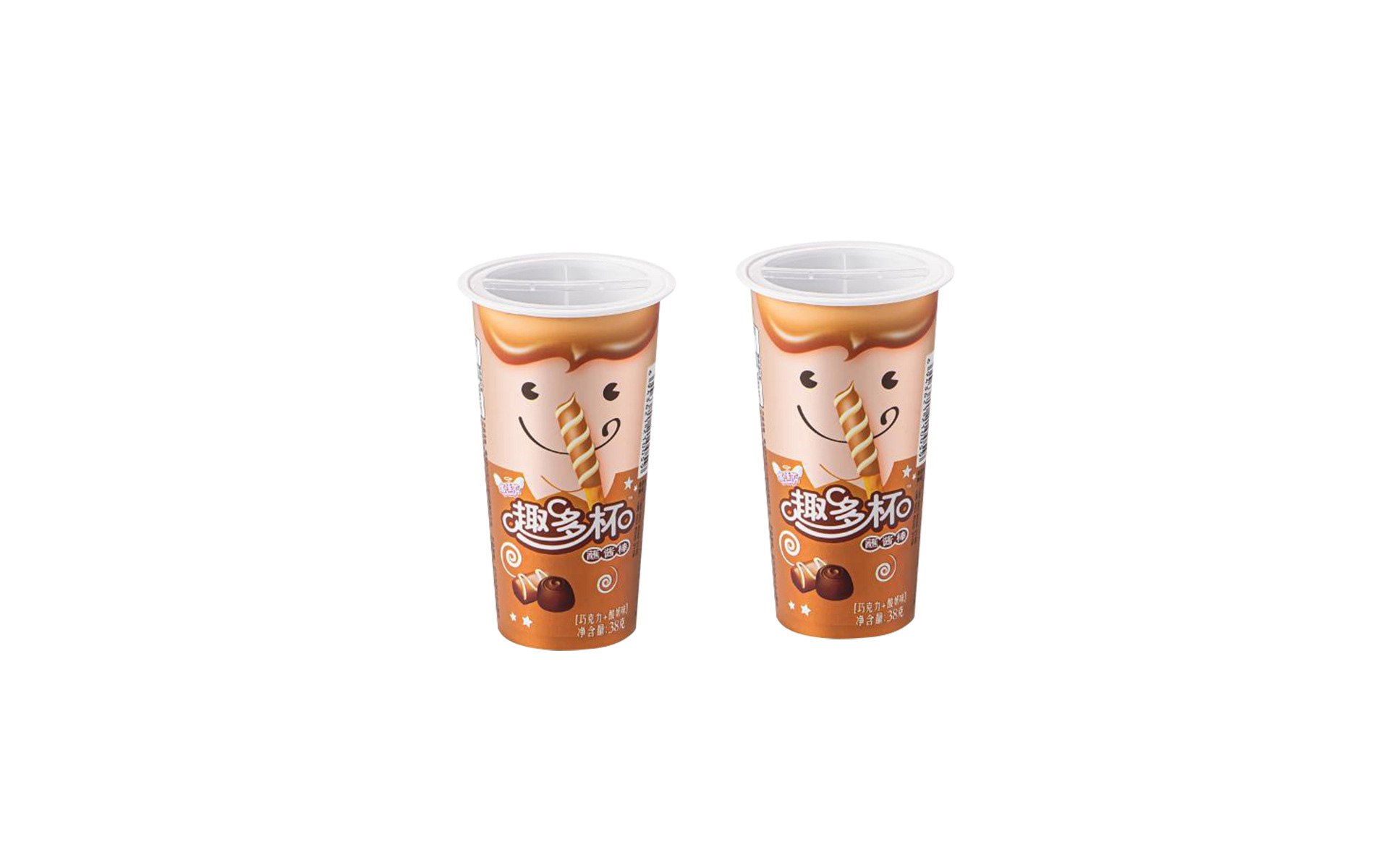
Whether you choose a transparent or non-transparent cup, there is an iron rule in IML label design – the seam of the label must be designed with a blank area.
The reason is simple: even with the most advanced in-mold labeling systems, there is approximately a 0.2mm tolerance at the label seam. For large cups with a capacity of up to 750ml, this is a considerable challenge.
If there happens to be a pattern at the seam, this 0.2mm deviation becomes very noticeable – pattern misalignment, broken lines, color shifts – flaws that are immediately visible.
But what if the seam is designed with a blank area?
"In this way, even if there is a deviation during the labeling process, the quality of the cup will not be affected." The blank area naturally "absorbs" that 0.2mm tolerance, and consumers cannot even detect the existence of the seam.
Design Iron Rule: Regardless of transparent or opaque design, the more sensible approach is to leave the seam area blank.
2. The "Transparent Aesthetics" of Clear Cups – Letting the Contents Be Part of the Design
The design logic of transparent IML labels is "less is more" – the more "invisible" the label, the more premium the design.
The greatest appeal of transparent labels is the "no-label look." They do not obscure the beverage inside, allowing the contents themselves to become part of the design. A vibrantly colored fruit tea or a beautifully layered latte – the beverage itself is the best "pattern."
In specific design terms, transparent labels require attention to the following points:
Make full use of transparency: A clear cup body paired with a bright tea label allows the richness of oolong tea, the freshness of milk, and the sweetness of fruit to be visually appreciated at a glance. Brand stories can also be told through the transparent cup wall.
The seam must be left blank: If pattern misalignment occurs at the seam of a transparent label, it becomes even more noticeable due to the transparent background. Therefore, seam blanking is particularly important for clear cups.
Keep patterns simple and focused: Patterns on transparent cups should not be overly complex – large solid color areas will obscure the contents and weaken the core selling point of "transparency."
3. The "Visual Authority" of Non-Transparent Cups – The Pattern Is the Entire Face
The design logic for non-transparent cups (white or solid color bodies) is completely different – there is no "background" to rely on; the pattern is the entire face.
White IML film provides a bright, opaque background that can significantly enhance the visual impact of graphics, making it very suitable for premium product packaging.
Key design points for non-transparent cups:
Patterns can be bolder: Non-transparent cups do not need to "make way" for the contents – the entire cup surface is a design canvas. Large color areas, complex illustrations, and high-saturation patterns can all be fully expressed.
White background is the "safe choice": White IML film provides a clean, bright base color that makes any pattern appear more vibrant and prominent.
Seam blanking is equally important: Even for non-transparent cups, the 0.2mm tolerance at the seam still exists. Blank design applies equally to opaque labels.
4. Bright Fruit Patterns – Why Do They Stimulate Purchase Desire?
Regardless of transparent or non-transparent cups, the choice of pattern theme is equally crucial. For cold drink cups, bright fruit patterns are a timeless "traffic code" for success.
Why are fruit patterns effective?
Fruit patterns can enhance consumers' desire to taste. Bright lemon yellow, strawberry red, lime green – these colors are inherently associated with feelings of "freshness," "refreshment," and "deliciousness." When consumers see bright fruit patterns, their brains have already "tasted" the beverage.
Additionally, fruit patterns are highly versatile. For non-brand-specific universal milk tea cups, choosing fruit patterns fully considers the cup's versatility, avoiding a too-strong brand bias that might limit usage.
5. FAQ
The core of transparent cup design is to "let the contents speak" – the more invisible the label, the more premium it feels, with the beverage's color and layers becoming the visual focus. The core of non-transparent cup design is that "the pattern is everything" – the entire cup surface is a display space, allowing for bolder, fuller patterns.
Because even the most advanced in-mold labeling systems have approximately a 0.2mm tolerance at the label seam. If there is a pattern at the seam, the deviation will be very noticeable; if the seam is left blank, the error is "absorbed."
Products where the contents themselves are visually appealing – brightly colored fruit teas, layered lattes, beverages with visible fruit pulp. Transparent labels let the contents "speak for themselves," achieving a premium "no-label look" visual effect.
Products that require strong visual impact. The white background can significantly enhance the visual impact of graphics, making brand logos and patterns more prominent. Suitable for premium brands, collaboration editions, seasonal limited editions, and more.
Bright fruit patterns can enhance consumers' desire to taste. The colors of fruit are deeply associated with feelings of "freshness," "refreshment," and "deliciousness," directly stimulating purchase impulses at the visual level.
Contact Us
Name*
Telephone*
Region*
Please fill in your request*


